AdaptivePlot#
AdaptivePlot renders adaptive comfort charts following ASHRAE 55 or EN 16798. The x-axis shows the prevailing mean outdoor temperature (Tpma or Trm), the y-axis shows operative temperature. Pass the model function (adaptive_ashrae or adaptive_en) and set air speed via set_params(v=...). When v ≥ 0.6 m/s and operative temperature exceeds 25 °C, the model applies a cooling effect that expands the upper boundary of each band.
import matplotlib.pyplot as plt

from pythermalcomfort.models import adaptive_ashrae, adaptive_en
from pythermalcomfort.plots.matplotlib import AdaptivePlot, RegionsConfig
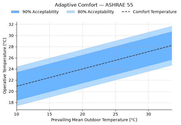
1. ASHRAE 55 — Default Chart#
With no set_regions call, all available bands are shown using their default colours. The dashed line marks the optimal comfort temperature.
ashrae_result = (
    AdaptivePlot(adaptive_ashrae)
    .set_params(v=0.1)
    .plot(title="Adaptive Comfort — ASHRAE 55")
)
plt.show()
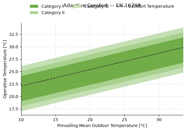
2. EN 16798 — Default Chart#
EN 16798 defines three categories (I, II, III) with progressively wider bands. Category I represents the strictest comfort requirement.
en_result = (
    AdaptivePlot(adaptive_en)
    .set_params(v=0.1)
    .plot(title="Adaptive Comfort — EN 16798")
)
plt.show()
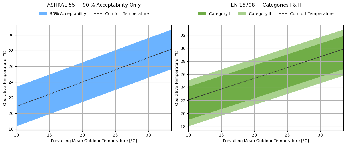
3. Selecting Specific Bands#
Pass a list of band keys to set_regions(show=...) to display only the bands you need. ASHRAE 55 uses '80' and '90' for 80 % and 90 % acceptability. EN 16798 uses 'cat_i', 'cat_ii', 'cat_iii'.
fig, (ax0, ax1) = plt.subplots(1, 2, figsize=(12, 5), constrained_layout=True)

(
    AdaptivePlot(adaptive_ashrae)
    .set_params(v=0.1)
    .set_regions(show=["90"])
    .plot(ax=ax0, title="ASHRAE 55 — 90 % Acceptability Only")
)

(
    AdaptivePlot(adaptive_en)
    .set_params(v=0.1)
    .set_regions(show=["cat_i", "cat_ii"])
    .plot(ax=ax1, title="EN 16798 — Categories I & II")
)

plt.show()
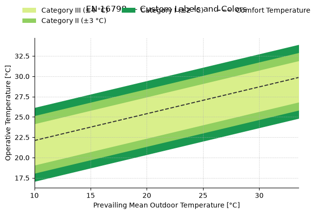
4. Custom Labels and Colors#
Band labels and colors can be overridden by passing labels and colors to set_regions. The list length must match the number of bands shown.
en_custom = (
    AdaptivePlot(adaptive_en)
    .set_params(v=0.1)
    .set_regions(
        show=["cat_i", "cat_ii", "cat_iii"],
        labels=["Category I (±2 °C)", "Category II (±3 °C)", "Category III (±4 °C)"],
        colors=["#1a9850", "#91cf60", "#d9ef8b"],
    )
    .plot(title="EN 16798 — Custom Labels and Colors")
)
plt.show()
5. Reusable Band Configuration with RegionsConfig#
RegionsConfig stores a band selection with optional custom labels and colors. Create it once and pass it to set_regions(show=config) to reuse the same definition across multiple plots.
ashrae_config = RegionsConfig(
    show=["90"],
    labels=["90 % Acceptability Zone"],
    colors=["#0067B2"],
)

fig, (ax0, ax1) = plt.subplots(1, 2, figsize=(12, 5), constrained_layout=True)

AdaptivePlot(adaptive_ashrae).set_params(v=0.1).set_regions(show=ashrae_config).plot(
    ax=ax0, title="Still Air (v = 0.1 m/s)"
)
AdaptivePlot(adaptive_ashrae).set_params(v=1.2).set_regions(show=ashrae_config).plot(
    ax=ax1, title="Moving Air (v = 1.2 m/s)"
)

plt.show()
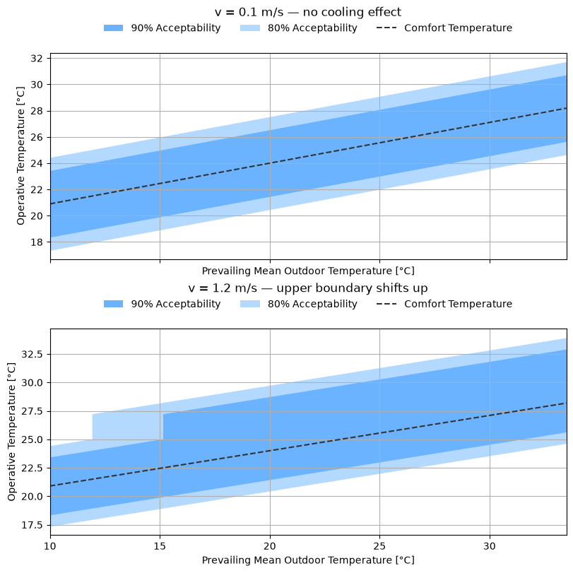
6. Cooling Effect: Still Air vs Elevated Air Speed#
When v ≥ 0.6 m/s and operative temperature exceeds 25 °C, the model shifts the upper comfort boundary upward. The side-by-side comparison shows the practical benefit of ceiling fans or natural cross-ventilation in warm climates.
fig, (ax0, ax1) = plt.subplots(
    2, 1, figsize=(8, 8), constrained_layout=True, sharex=True
)

AdaptivePlot(adaptive_ashrae).set_params(v=0.1).plot(
    ax=ax0, title="v = 0.1 m/s — no cooling effect"
)
AdaptivePlot(adaptive_ashrae).set_params(v=1.2).plot(
    ax=ax1, title="v = 1.2 m/s — upper boundary shifts up"
)

plt.show()
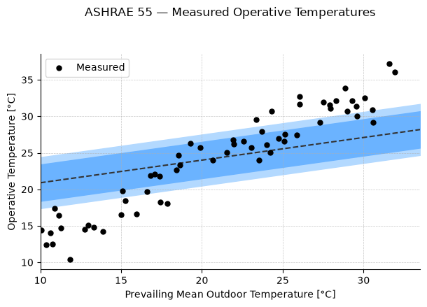
7. Returned Artists#
result.ax is the Matplotlib Axes with all the standard methods. Use it to overlay measured operative temperatures on the chart.
import numpy as np

rng = np.random.default_rng(0)
t_outdoor = rng.uniform(10, 32, 60)  # prevailing mean outdoor temperature
t_operative = t_outdoor + rng.normal(3, 2, 60)  # typical indoor-outdoor offset

result = (
    AdaptivePlot(adaptive_ashrae)
    .set_params(v=0.1)
    .plot(title="ASHRAE 55 — Measured Operative Temperatures")
)

result.ax.scatter(
    t_outdoor, t_operative, color="black", s=25, zorder=5, label="Measured"
)
result.ax.legend(loc="upper left")
plt.show()